A MODERN MAKEOVER IN CITY BEACH
This dated and dreary home is perfectly defined as ‘the worst home on the best street’. The original cold, grey living spaces felt hard and uninviting, despite the gorgeous views overlooking my favourite northern beach. But we knew there was amazing potential here to be found, and we transformed this 80s doer-uper into an elegant haven of natural light.
One of our biggest challenges in transforming this space was how to proportionately furnish two overly large, side-by-side living spaces.
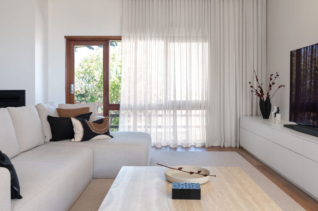
We resolved this interior design dilemma by defining each side with a particular mood and purpose. On the left was the formal lounge, a place to have lively conversations or get lost in a good book. The space on the right became more casual with a TV for family entertainment.
We made several structural and aesthetic improvements to reveal the diamond that I knew was hiding under this rough exterior.
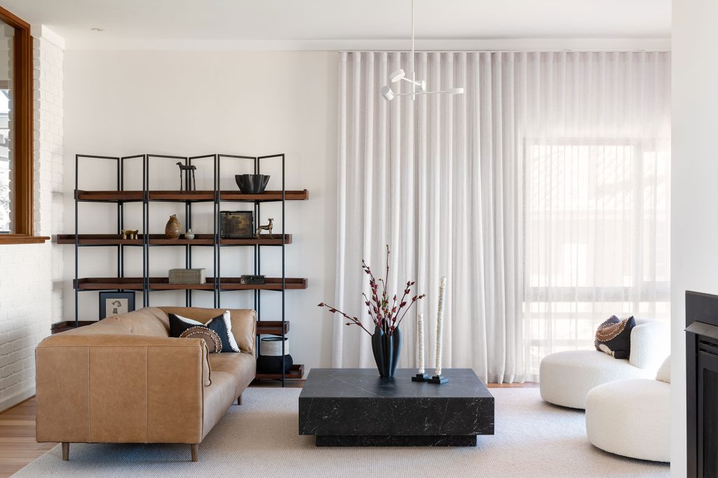
First, we repainted everywhere in a fresh white, which included covering the internal brick and timber cornices, banishing the awful 80s aesthetic. For a touch of contrast, we decided to keep the original window and door frames and we drew inspiration for the soft furnishings from the warm wood tones.
Next, we ripped up the daggy grey carpet and replaced it with quality engineered timber floorboards.
The brightening of these spaces was instant and magnificent! VJ panels added a touch of subtle texture to the walls, while the original internal brick got a crisp white makeover.
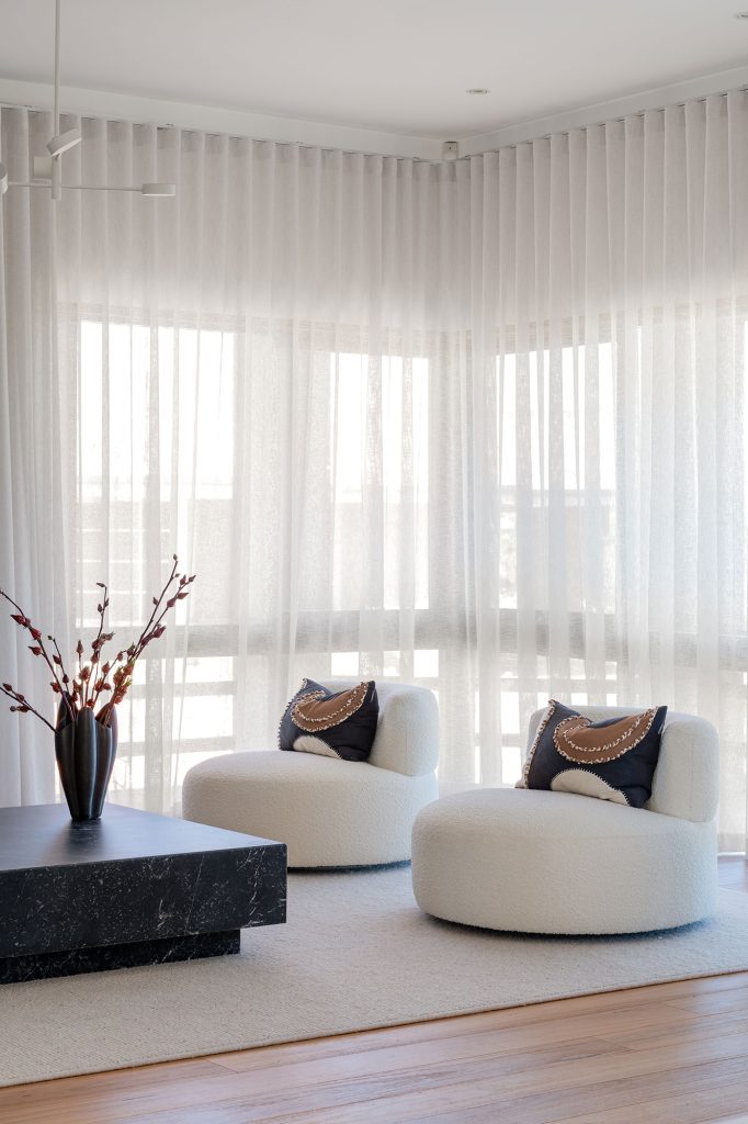
We added a softness to both rooms with sheer linen curtains that filter the western sunlight, layered with blockout roller blinds.
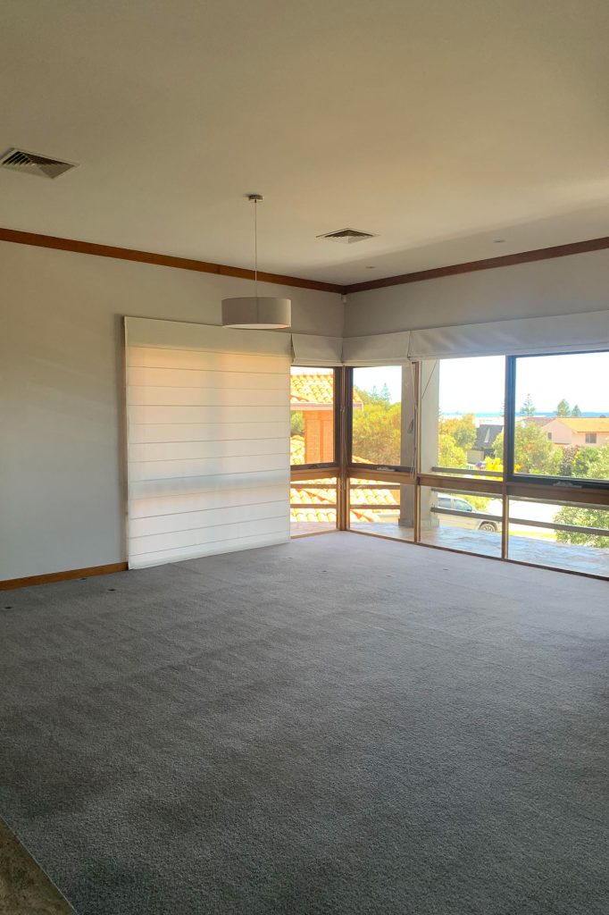
The former pendants with their blinding cool white bulbs were replaced with gorgeous streamlined matte white pendants that don’t distract from other features but enhance the modern minimalistic feel.
Now let’s talk styling. Embracing a contemporary and minimal aesthetic, the streamlined furniture and organic textiles together create an elevated yet casual atmosphere with a hint of luxe. By emphasising sexy curves in just the right places and adding punches of onyx contrasted again the fresh bright whites, we brought this dated home into its cool girl era.
Let me give you an interior design tip: A light and bright lounge room doesn’t mean that all the furniture must be white.
By opting for monochromatic and deep neutral tones, we created a contrast that accentuates the fresh white look. The formal lounge on the left leant into strong defined lines and dark accents.
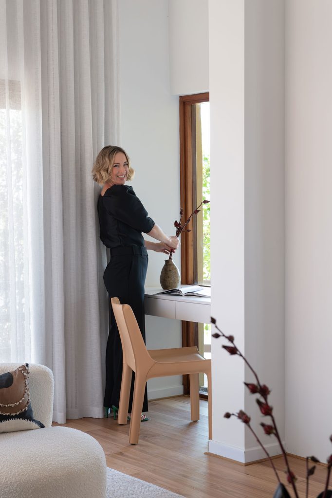
We saw an opportunity for a mini study nook in the corner of this space, which takes advantage of the stunning natural light.
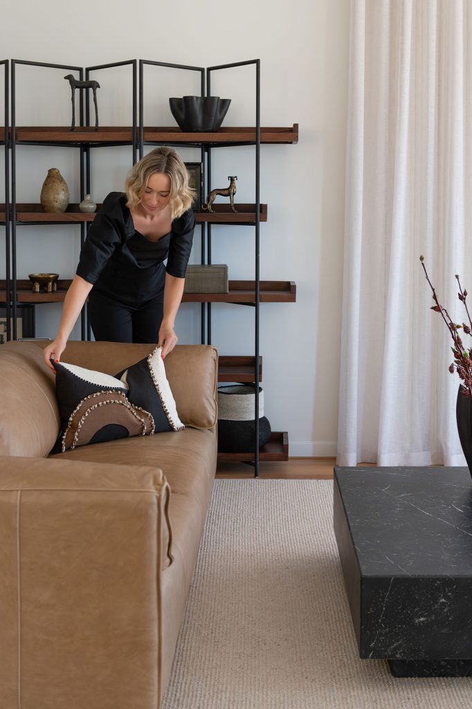
On the casual living side, we selected a plush neutral sofa and a sandy travertine-look coffee table. We had a lot of space to work with along the back wall, and we got really excited about designing dual purpose cabinetry. This benchseat – upholstered in divine Kelly Wearstler fabric – was designed to deliberately break up the extra-long space from the streamlined storage.
Overall, we’re proud to have delivered yet another stunning renovation, embracing the brief of minimal and modern with a bit of ‘oomph’ while remaining comfortable and lived in.
Here’s what our lovely client had to say at the grand reveal of this project:
“Lisa was an absolute pleasure to work with, attentive, great interpersonal skills, knowledgeable in her area of expertise, and extremely creative to boot- she is genuinely excited by the design process and the canvas that unfolds in consultation with the client.
Having utilised Lisa’s services on a renovation project a decade ago, there was no hesitation to contact her for my current requirement. The experience was invigorating, and the project was seamless in its delivery… nothing was too hard and the confident, quiet assured guidance from Lisa, imbued trust and faith in a sometimes wavering and hesitant client, somewhat restricted by limited artistic vision and creativity, confused and distracted by a plethora of information readily available on the Internet.
There was never any pressure for decision on the multiple options presented, focus was always on budget and my personal preferences, and Lisa was ever mindful of not overriding my choices, or dismissing any reservations, and hesitancy or uncertainty I overtly or covertly expressed.
Lisa has transformed a dull and dreary space into a bright, vibrant, aesthetically pleasing home that I am absolutely loving… maybe too much, as I just love chillin’ in the lovely space she created, forgetful that there is a world outside of its borders – beautiful job!”
If you’re renovating this year, here’s some of the ways we can help you:
– Full service Interior Design for turn key solutions
– Joinery and Cabinetry design for bespoke storage
– Furniture procurement for maximum comfort
– Fixture and Fittings selections for timeless style
– Lighting and Window treatments for elegant silhouettes
– Wall Art sourcing for the ultimate wow factor
Experience the Collected Interiors difference in your home. Book your consultation with Lisa today.